Tower – A universal language for coworking.


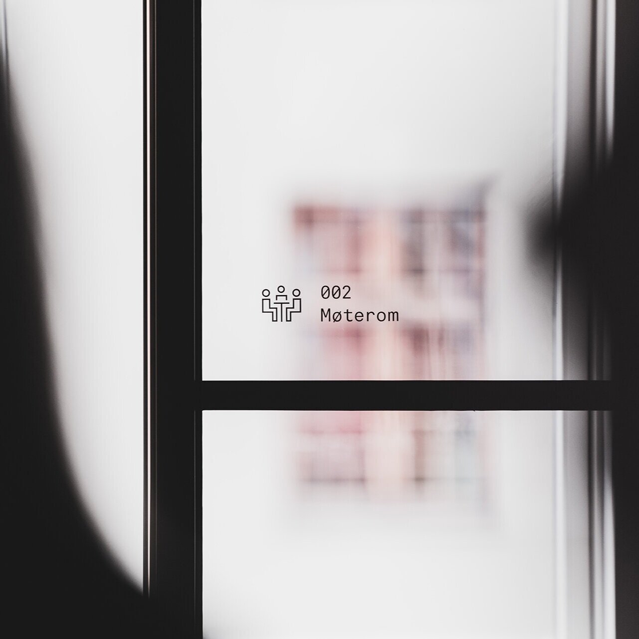
Our brief was to develop the concept, visual identity and conceptualization in the interior of Bergens newest coworking, Tower. A modern coworking space for urban business people.

What differentiates Tower from other coworking spaces in Norway, is the urge to create a more efficient work place. As coworking often is synonym with creative business, socialising and inefficient work hours, Tower wanted to be the counterbalance. A place where the digital time age meets urban business people. A place where shit gets done.


1.jpg


A coworking space is defined by the people who work there. We reflected the core of Tower in building a universal language for modern coworking. We translated human behaviour into a digital visualisation of people in pixel blocks. The logo is built around the same parameters, using the letters as framework. Tower is the structure around the dynamics of people - the physical space around workers, as are reflected in the letters surrounding the logo elements.

 
2.jpg
 
14.jpg
6.jpg
 
5.jpg
Buffer.jpg
 
 
Screenshot+2020-02-14+at+00.37.09.jpg
 
 
Mobilsider.png
 
Screenshot+2020-02-14+at+00.37.09.jpg
 
 
Webdesign-2-test.png


Screenshot+2020-02-14+at+00.37.09.jpg
 

The elements are visible throughout the entire brand experience. From physical wayfinding on the walls and furniture, to internal software on screens.

 
11.jpg
 
15.jpg
 
13.jpg
 
7.jpg
 
Buffer.jpg
Buffer.jpg


Buffer.jpg
 
 
Buffer.jpg
Buffer.jpg


Buffer.jpg
 
 
16.jpg
 
19.jpg