Frende – Revamping insurance
Frende is a different kind of insurance company that is owned by several local banks throughout Norway. Frende was started in 2007 on the basis of wanting to create an insurance company that one self would want to be insured in, from the customer's perspective. Now, over ten years later, Frende has proven these values time and time again by winning product tests, customer service awards and becoming the industry leader for satisfied customers. Today, there are hundreds of thousands “Frendes” (customers) around the country.
In 2021, we launched the new identity for Frende which is based on this community - and their common values, which are based on in-depth insight from Frende's own customers. The brand promise "simpler and more human insurance” therefore became the starting point for the new brand.


The brand and its communication is true to the original principle of insurance, and how it really is a community, where each person contributes so that everyone in the community is insured. Insurance is for the many people. Therefore it should also simply make sense, for everyone. Simple, human, relatable.
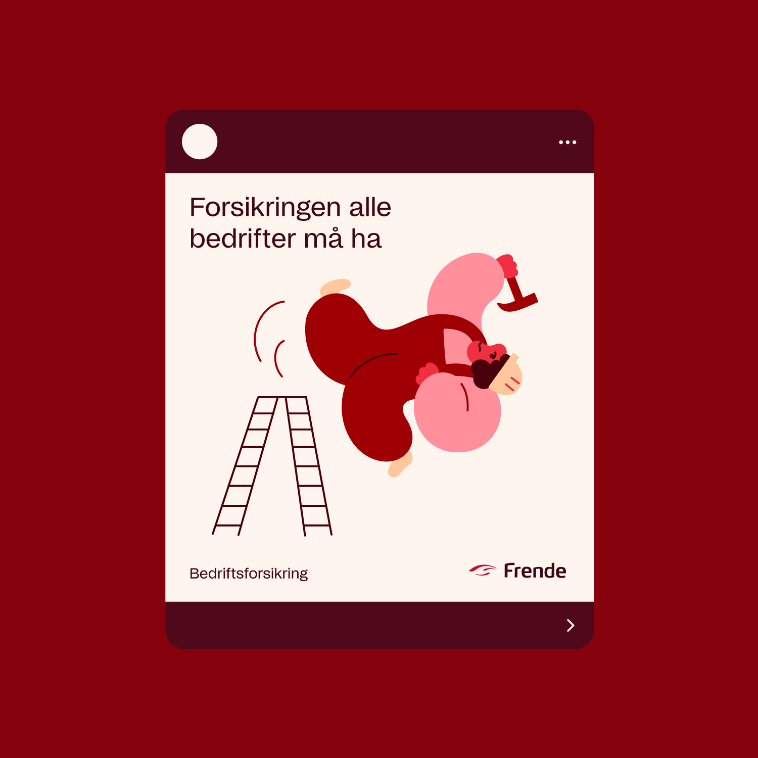
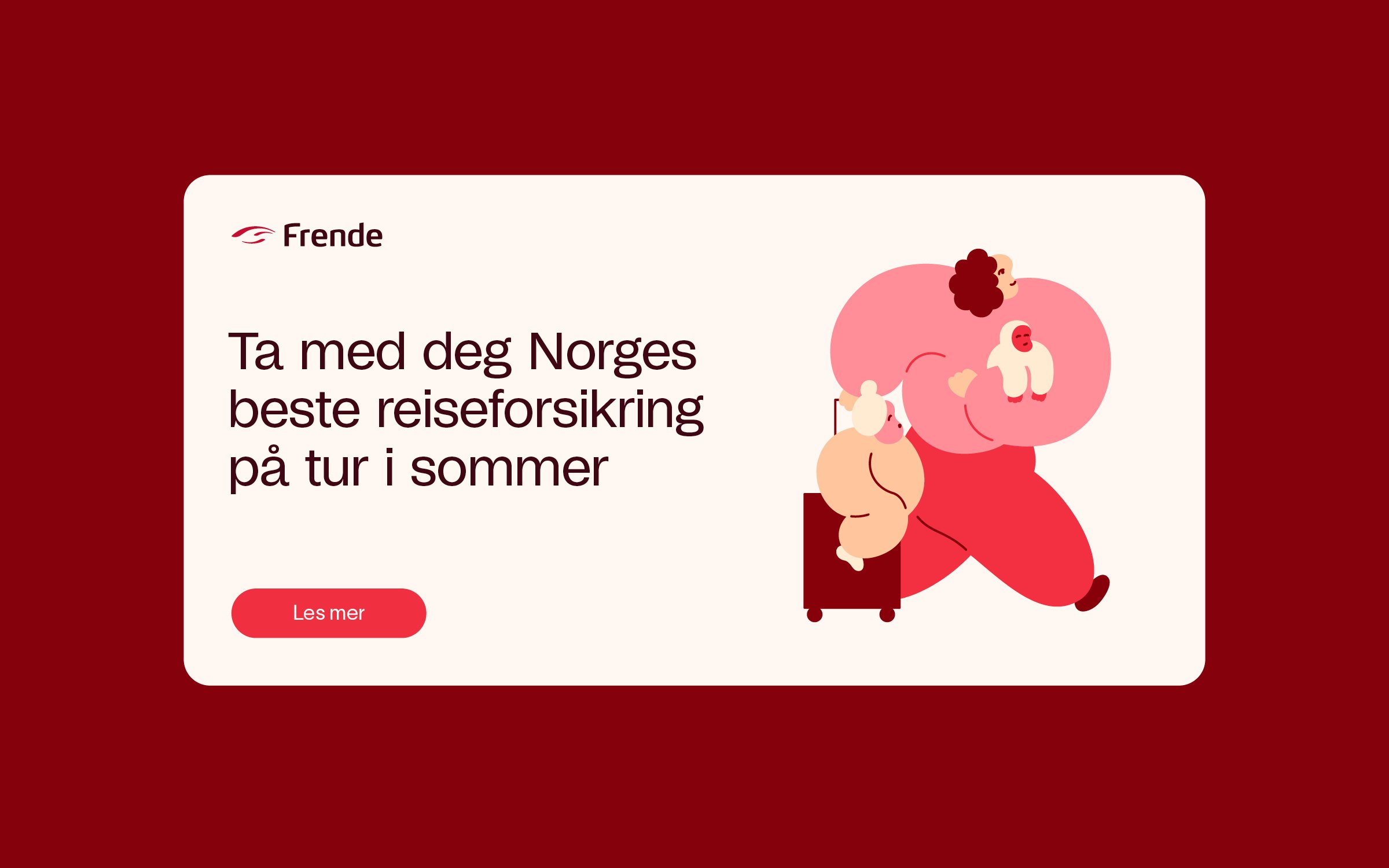
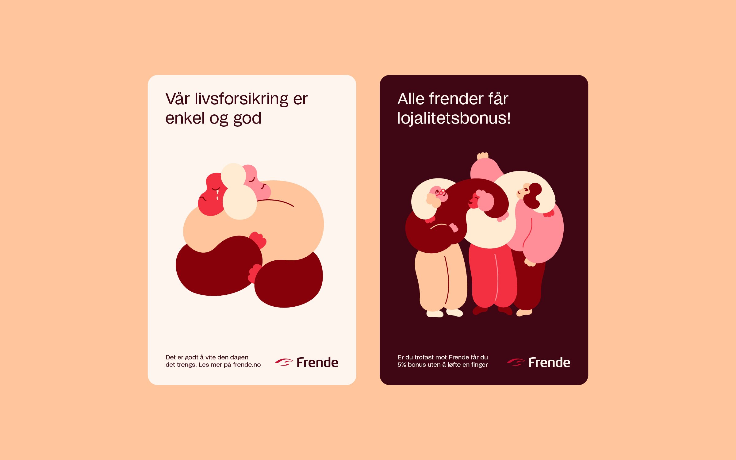
So how to translate abstract properties such as simple and human into something concrete, and uncomplicate and humanise the universe of insurance? We developed a visual concept around “the pillow”, with the softness, sense of safety and simple comfort associated with it. Translated into a graphic look, the outcome is adaptive shapes, huggable illustrations, soft colour combinations with warm images and authentic brand movies shot on film. The overall concept represents several of the company values and is always present on every surface the brand is visible on.


Services:
Brand Strategy / Brand Architecture / Visual identity / Art Direction / Graphic Design